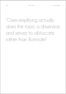
Having the information down the side does make it a lot more interesting but does it suit the context in this book?
Having it all at the top like a line really makes improves it from the two lines. The spaces balances out effectively.
Having it dotted around in the corners is not easy on the eye.
Having it at the bottom might I don't think it works.
Again having the number pages looks slightly left out.
Again it still looks dotted and prefer having it on a long line.
I thought of maybe the green might be too hard to read. making it the same colour as the written answers.


No comments:
Post a Comment