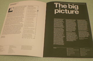
This is a odd style but but really interesting idea but could be confusing. But I like how its differenet being scatted about with the designer images and makes it fun too look at to follow the lines.


This is a simple design element layering the images on top of each other. The creamed yellow background makes it more appealing than a boring white background. Which I think I might it out.
I will need to do this for each image with title of image and date but I know some of images
This is simple design but in a complicity of layout and image.
I am looking at the layout of typography with a random rectangle shapes.
But I think it looks like a graph table.
I like how the images are in a huge clump of a block up at the top. Also the typography is in block shape layout. They are also completely apart with large space between each other.


No comments:
Post a Comment