Friday, 30 April 2010
Image /Quote
I tested to see if the which would be a better background. coloured back ground looks good but I prefer it as white background and use
I put a images which are simple that relate to the quote.
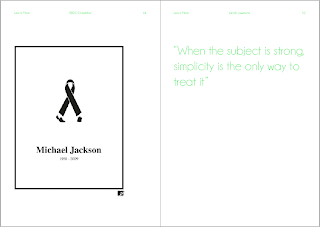
I linked the image and quote because Micheal Jackson is an iconic and is big subject about him as person and his lifestyle also he was a strong subject what everybody talked about his death. The quote is well liked with the image of the subject and how it presented in a iconic i meaning of a iconic figure.
This one of the famous piece of design with form over function. A lot of believe this juice squeezer doesn't actually work and there for show, but actually it does work! Its a sleek simple design just like in the quote.
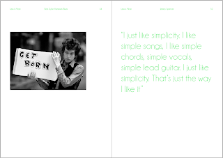
I just thought this would fit perfectly with Hans Gremmen comment in my book about what inspires him which was Bob Dylan and the video Home Sick Blues.
"The music video ‘subterranean homesick blues’ from Bob Dylan. One of the best video’s ever made, with (almost) no budget. Just a simple idea, and also some twists within that simple idea. That makes it clever, otherwise simple ideas are an excuse to be home early at the end of the day'
Jeremy Spencer from Fleetwood Mac said a quote about music and felt that Bob Dylans lyric and video is a suitable concept to match with all these elements. Personally it works perfectly.
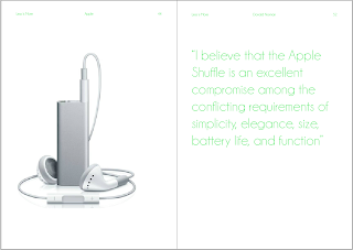
All of apple products are so very simple and stunning. This seemed app riot to put a apple shuffle and a quote from Donald Norman ho is an author of a book about every day objects.
BBDO
Joe Prince
A company admix designs create simple and cleaver concept logos. The shading frame makes it a lot more professional. I have already emailed Joe Prince a few same questions I have sent to the other designers.
Controversial but very clever design
The word 'back' taking the 'a' away, still able to understand the word and also a concept of putting the line after the space like its being typed on the computer.
The colour works a like a green brush of field. Using the word 'fence' from into a fence
www.admixdesigns.com
Thursday, 29 April 2010
Simplisty Quotes
These are amazing quotes but need to cut it down to a few so that I can realate to with my book and example of the quote being backed up.
A snowball is simple, direct and familiar to most of us. I use this simplicity as a container for feelings and ideas that function on many levels.
Andy Goldsworthy
A snowball is simple, direct and familiar to most of us. I use this simplicity as a container for feelings and ideas that function on many levels.
Andy Goldsworthy
A taste for simplicity cannot endure for long.
Eugene Delacroix
Eugene Delacroix
As beautiful as simplicity is, it can become a tradition that stands in the way of exploration.
Laura Nyro
Laura Nyro
As I grew older, I realized that it was much better to insist on the genuine forms of nature, for simplicity is the greatest adornment of art.
Albrecht Durer
Albrecht Durer
In character, in manner, in style, in all things, the supreme excellence is simplicity.
Henry Wadsworth Longfellow
My Fav:
I believe that the Apple Shuffle is an excellent compromise among the conflicting requirements of simplicity, elegance, size, battery life, and function.
Donald Norman
Donald Norman
I despise simplicity. It is the negation of all that is beautiful.
Norman Hartnell
Norman Hartnell
I don't need a lot of money. Simplicity is the answer for me.
Linda McCartney
Linda McCartney
I wish I had invented blue jeans. They have expression, modesty, sex appeal, simplicity - all I hope for in my clothes.
Yves Saint Laurent
Yves Saint Laurent
I just like simplicity. I like simple songs, I like simple chords, simple vocals, simple lead guitar. I just like simplicity. That's just the way I like it.
Jeremy Spencer
Jeremy Spencer
Seek simplicity but distrust it.
Alfred North Whitehead
Simplicity does not precede complexity, but follows it.
Alan Perlis
Alan Perlis
Simplicity is natures first step, and the last of art.
Philip James Bailey
Philip James Bailey
Simplicity should not be identified with bareness.
Felix Adler
Felix Adler
The English language has a deceptive air of simplicity; so have some little frocks; but they are both not the kind of thing you can run up in half an hour with a machine.
The great seal of truth is simplicity.
Herman Boerhaave
Herman Boerhaave
There is a certain majesty in simplicity which is far above all the quaintness of wit.
Alexander Pope
Alexander Pope
When the subject is strong, simplicity is the only way to treat it.
Jacob Lawrence
Jacob Lawrence
http://www.brainyquote.com/quotes/keywords/simplicity_5.html
Kasimir Malevitch
"Painting is the aesthetic side of the object but it has never been original, has never been its own goal"
1923-1930
His work is very simple using canvas and plain colours.
http://www.artlex.com/ArtLex/m/minimalism.html
http://www.brainyquote.com/quotes/authors/k/kazimir_malevich.html
Minimalism Quotes:
The more minimal the art, the more maximum the explanation."
Hilton Kramer (1928-), The New York Times art critic, in the late 1960s.
"What you see is what you see."
Frank Stella (1936-), American painter, 1966. Critic Deborah Solomon and others have described this statement as the unofficial slogan of the Minimalist movement.
"Minimal art was the first art form to come out of the universities rather than the artists' ghetto. This interest in Minimalism and later in Conceptualism can only happen to people who have a historical consciousness."
William Rubin
William Rubin
http://www.artlex.com/ArtLex/m/minimalism.html
These quotes can be backed up with images. Showing example of minimalistic design.
Quote
I found a poem about less is more which I find can really relate to simplicity.
Who strive - you don't know how the others strive
To paint a little thing like that you smeared
Carelessly passing with your robes afloat,-
Yet do much less, so much less, Someone says,
(I know his name, no matter) - so much less!
Well, less is more, Lucrezia.
To paint a little thing like that you smeared
Carelessly passing with your robes afloat,-
Yet do much less, so much less, Someone says,
(I know his name, no matter) - so much less!
Well, less is more, Lucrezia.
An architect Ludwig Mies van der Rohe adopted the motto "Less is more" showing a building to create an impression of extreme simplicity. This would be good to get a quote more from his interviews.
book cover
Making the typography larger makes lot more interesting. Its still simple and but it is not boring. and again the "?" needs taken off.
Ludwig Mies Van Der Rohe (1886-1969), one of the founders of modern architecture and a well known simplicity of style.
Gradutalty the typography is getting bigger. I like the concept the more bigge the typography the louder it looks.
Making the cover as a quote is a bit odd but I like its quirkynes and might match with book.
Who strive - you don't know how the others strive To paint a little thing like that you smeared Carelessly passing with your robes afloat,- Yet do much less, so much less, Someone says, (I know his name, no matter) - so much less! Well, less is more, Lucrezia.
Ludwig Mies Van Der Rohe (1886-1969), one of the founders of modern architecture and a well known simplicity of styler.
Monday, 26 April 2010
Snake Basket
This is a fantastic homemade product and cheap to make.By Aimme who has created her own blog showing how to make cheap decreation.
sfaustina
Francis Coppola. I am looking at bottle labels being wrapped round the bottle drinks. The idea of the cobra drink is to make a snakes cobra wrap around the drinks bottle.
Sunday, 25 April 2010
Vintage Typography
When I went to the National Railway Museum at York I found a lot of the typography had a great authentic look and would help me with my country cakes brief to make it vintage but also country but looks modern as well. Which is a difficult balance I find.
Having a lion to symbolise British which is common animal to represent England as being strong and full of pride. The typography also has the strenght of being bold and not decorative.
The different size of the typography and the outline with also the bright British red colour makes it look very English.
This style of typography relay relate to my country cakes of being traditional and country feel.
Saturday, 24 April 2010
SHCH Graphics Groups Portfolio
I am now looking at how I would use actual objects of being typography.
Really like how the petills make it as a typography and yellow stands out from the white background. But what does daisy flowers to do with love.
Luke Lucas
I have cahnged my plan for the rvise brief I am going to make it as decreative typography rather than just plain boring design which didn't work at all for the breif that I was doing.
But the problem if I am doing it was decorative typography should I do it as luke has done on illustrator or as actual objects like for instances one of my quotes:
How can you delay milk turning sour? Keep it in a cow so I could use milk into typography by photographing it.
His typography looks really glossed and also very easy to read. The four shades of colours makes it more interesting to read and doesn't over load. But this is a good example what I do with milk typography.
Mkaing typography with tongues is odd but also really works with the siliaver on the tongues dripping off.
See this subject is about drinking so the typography is design to look like water.
This is a brilliant typography looks like bubbles or balloons about to pop. It is made to look by making the it round shape and putting the white curves.
I think this might look nice but really hard to read.
Friday, 23 April 2010
grid Layout research
This is a odd style but but really interesting idea but could be confusing. But I like how its differenet being scatted about with the designer images and makes it fun too look at to follow the lines.
This is a simple design element layering the images on top of each other. The creamed yellow background makes it more appealing than a boring white background. Which I think I might it out.
I will need to do this for each image with title of image and date but I know some of images
This is simple design but in a complicity of layout and image.
I am looking at the layout of typography with a random rectangle shapes.
But I think it looks like a graph table.
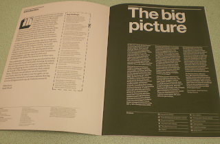
I like how the images are in a huge clump of a block up at the top. Also the typography is in block shape layout. They are also completely apart with large space between each other.
Subscribe to:
Posts (Atom)