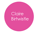
The typography brings the shine polish look and having circle shape in the middle makes more eye catching, even though there are grey colours used it doesn't cold or boring it suits the context.
The information is well organised and separated but too dull to look at.

http://www.leonjorge.com/


No comments:
Post a Comment